If selecting a color scheme for your home – or even a single room – is a challenge for you, look around with new eyes. Our natural environment is full of glorious hues, and a beautiful scene outside your window may be the perfect inspiration for colors inside your home.
Despite the cold, sometimes cloudy and dreary days that winter brings us here in the Midwest, there is also beauty to be found in all of those sub-freezing temperatures. What’s more, if you take a moment to enjoy the beauty of a winter day, you may also be blessed with the perfect color scheme for your next decorating project.
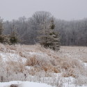
Take a peek at this photo I took near my home:

While this frosty scene may look cold and gray at first glance, if you take a closer look you will see some lovely, muted colors that would be a wonderful addition to many homes.

Colors from left to right, all from Sherwin Williams: #6107 Nomadic Desert, #6108 Latte, #7073 Network Gray, #7074 Software, #6172 Hardware, #6173 Cocoon
I chose a palette of paint colors from Sherwin Williams based on my winter landscape photo. While these colors could be tweaked to lighter or darker tones or shades, they give you an idea of how a color scheme can be pulled right from a photo. I used the sky and trees to give me a couple of gray tones that teeter on the edge of blue. The grasses in the front of the photo inspired the tan colors, while the evergreens brought deep gray-green into the scheme.
Now, what to do with these colors? You could decide that one of the colors would be best on the walls in your room – maybe the lighter gray or beige? The deep gray-green could be used in furniture – maybe a leather sofa or chair. The deep gray or tan could work well for new carpet or an accent wall. And, of course, bright pops of color could be added for accents – perhaps a rich gold or deep terracotta.
Take a look around you and you may be surprised at the color inspiration you see in the most mundane of scenes or objects.
Pin It
Hi, I was thrilled to find your site with colors pulled from nature. I have used wall hangings, paintings, photos… You get the idea, but I was missing the obvious, NATURE! After a remodel eight years ago, I wanted to update my paint colors. The beautiful green, grey, gold tile looked beautiful with Moss Green Paint done in brushed suade style. I am ready to move on, but trying to take my tile colors in my Master Bath and Utility Room to a gray-blue in my adjoining Master Bedroom presented a problem. I was one of those that always wallpapered. The color you chose was the color you got. I just wished paint were that easy! I believe your inspirational piece will work beautifully!
Thank you, so, so much!
Linda B.
Oh yes, any suggestions are welcomed!
Thanks so very much for your kind words! Sometimes, the simplest things can provide color inspiration…no need to search too far from home. Without seeing the tiles, I can’t offer specific paint options for you, but I would look for a bluish color with a lot of gray in it, to pull the gray out of your tiles rather than the green or gold. If you go too blue, it may not look right (although, a crisp robin’s egg blue may contrast the tile beautifully!), so be sure to look for something mostly gray with just a hint of blue. I hope that helps! Thanks for stopping by! 🙂